TL;DR version
Project: SentiVue Connect (UX Upskill, Hyper Island)
Timeline: ~6 weeks
Objective:
Redesign an AI-powered live video-call translation tool to improve usability, especially for users like Luís, a 45-year-old immigration officer with no time for steep learning curves.

Impact:
Faster, more intuitive meeting access
Greater user confidence & readiness before calls
Lower cognitive load via clarified visuals and flows

What we did:
Did research & used provided proto-personas → focused on “Luís.”
Identified key pain points: poor navigation (horizontal scroll), hidden language/hardware settings, confusing icons & clutter, no feedback after calls.
Produced UX deliverables: user journey map, storyboard, user flows, design system, and interactive prototype.
Solutions:
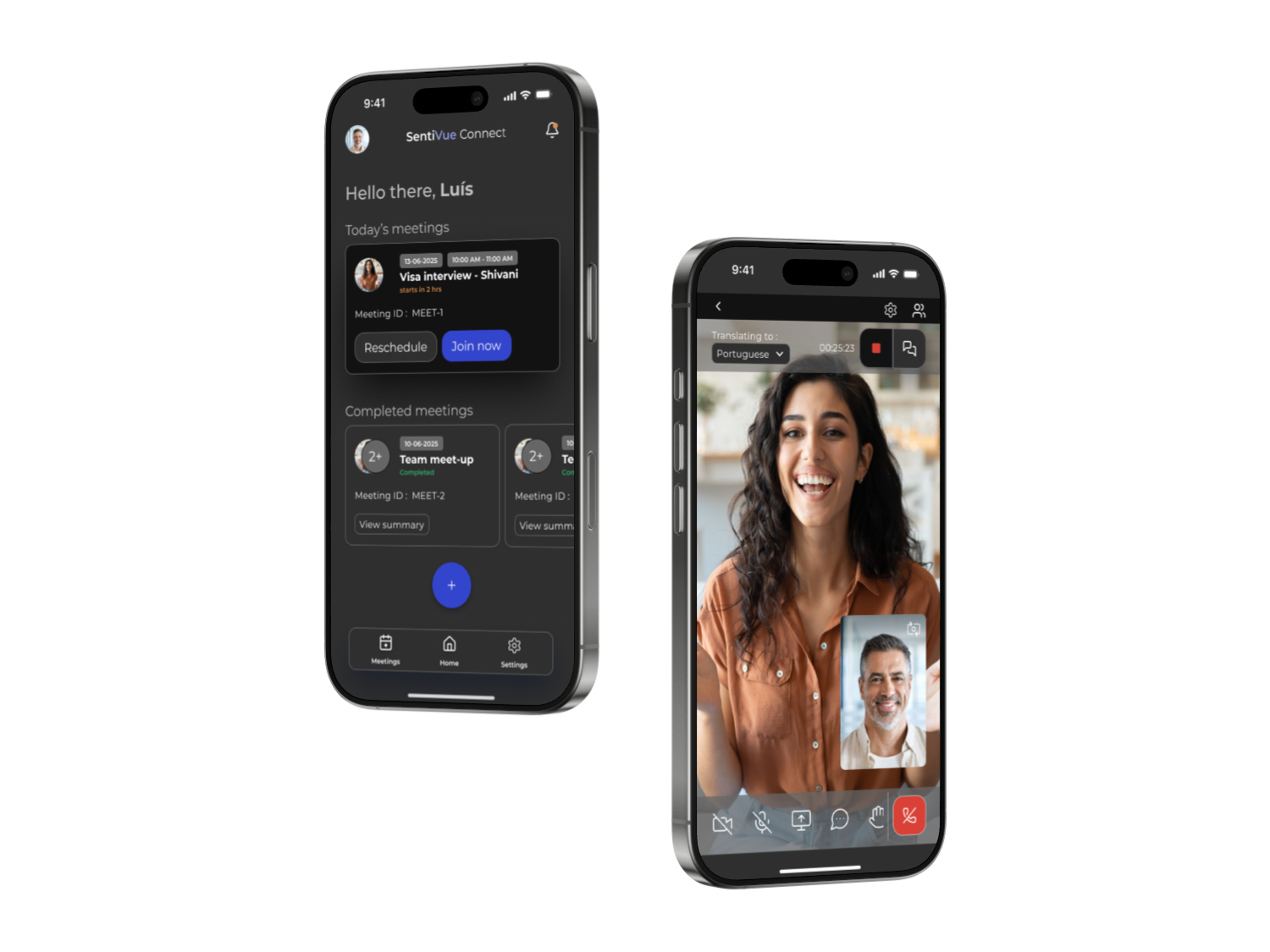
Redesigned meeting cards (no more horizontal scrolling)
Added a pre-call setup panel for language + hardware checks
Standardized icons + cleaned up dashboard; introduced dark mode for visibility
Built post-call feedback module (confirmation of recording, summaries, follow-ups)
Long Version
As part of the UX Upskill course at Hyper Island, I collaborated with a team of 3 other students to design a launch-ready mockup for SentiVue, a client offering AI-powered live translation for video calls.
We were additionally provided with a set of proto-personas by the client to address a type of user’s specific needs. Although we want to ideally design for a number of different users, choosing one persona helped us focus on delivering a product in such a short time period.
Our choice of proto-persona was Luís, a 45-year-old immigration officer from Lisbon. He hosts visa interviews from a desk browser with applicants in India or China, has strict recording rules, zero time for deep tutorials. He wants an “On/Off” language switch that never hides in sub-menus.

Identified Issues with SentiVue’s Existing Platform
During discovery, our team identified several significant pain points within the current platform:
Difficult Navigation: Users had to horizontally scroll across the interface to find and join meetings, reducing efficiency and increasing frustration.
Unclear Language Settings: Language preferences and hardware setup were hidden, causing confusion and potentially leading to avoidable technical issues during calls.
Non-Standard Icons & Cluttered UI: Icons did not follow established conventions; the dashboard included irrelevant features, increasing the cognitive load.
Lack of Post-Call Feedback: Participants received no confirmation or useful information after the call, leaving them uncertain about call recordings and follow-up actions
To better understand users’ pain points and clarify opportunities for improvement, we mapped the current user journey in a UJM. This helped us empathize with Luís’ struggles and prioritize actionable enhancements.
User-Centric Opportunity Statements
With our user journey map completed, we reframed the core challenges as key opportunity areas:
Quick Meeting Access:
How might we help users easily see and join their scheduled meetings without unnecessary navigation?Confidence in Call Setup:
How might we help users feel confident that their language settings, translation options, and hardware are ready before a call starts?Empowering Post-Call Feedback:
How might we ensure users receive useful, reassuring information after calls, such as confirmation of recordings and next steps
Additional Deliverables
1. Storyboarding
Our storyboard visualized the new, ideal flow—emphasizing clarity and efficiency. Shivani, Luís’ immigration applicant, made her introduction.
2. User Flow & Wireframing
We defined clear user flows for entering a SentiVue call, including options like a picture-in-picture window should Luís want to check Shivani’s application during the call.
3. Design System
To ensure visual consistency, we developed an atomic design system, building meeting cards that could be easily replicated during the prototyping process.


Key Solutions Implemented
Meetings Cards: Replaced horizontal scroll meeting cards and clear buttons, making it effortless for Luís (and any other user) to see and join their scheduled calls.
Pre-Call Setup Panel: Added prominent language and hardware check in a meeting “lobby,” ensuring users feel prepared and minimizing disruptions during calls.
Standardized Icons & Streamlined Dashboard: Pruned unnecessary features, following familiar conventions and reducing visual clutter. Also changed the style to dark mode to increase visibility.
Post-Call Feedback Module: Provided instant confirmation that calls were recorded, along with useful summaries and follow-up options.
Outcomes
Our redesign directly addressed critical usability issues for Luís by:
Boosting efficiency: Meetings are easier to join, and core information is surfaced at the right time.
Increasing user confidence: Clear setup and feedback reduce uncertainty.
Reducing cognitive load: A cleaner interface with familiar video call conventions supports effortless navigation.


Reflections
One thing we struggled with was, of course, time. Being new UX designers with work, family, and other commitments sometimes made it difficult to align, but we found time in the late night hours to crank out some solutions.
We received feedback from our course leader that the line between AS-IS and TO-BE on our UJM seemed at times blurred and that our opportunities could have been clearer by connecting them to identifiable usability issues. We had originally done this, but felt that connecting them created too strict of guardrails for our design process which in retrospect may have been good.
This project taught me the value of early planning in UX—especially mapping realistic user flows before focusing on visuals. Further feedback showed me I could improve by representing nuanced user decisions and branching paths in flow diagrams, which would help prevent usability issues later.
I'm proud of the accessible design system and intuitive navigation our team created; the polished prototype made key interactions clear for users of all levels. Going forward, I’ll prioritize more immersive, feature-complete prototypes and keep refining how I visualize user journeys for realistic, effective solutions.